A dating app where the first date is built in
Tonight turns a match into a planned cinema date — agree on a film and a showtime, buy tickets, all in one flow.
This case explores how the concept could be reimagined today through modern UX, visual design, and product thinking, with AI integrated throughout the creative process to accelerate research, ideation, and iteration.
Unfinished business
from the past
Ten years ago I co-founded a dating startup. The idea was great but we focused too much on building a social network around the experience instead of doubling down on the core dating mechanic. Revisiting the idea also meant redesigning it from scratch — after a decade, both the product and the way we design products have changed dramatically.
Back then, research alone would have taken days. This time, Claude became my primary design partner —from product thinking to designing screens alongside Figma. Mobbin accelerated pattern research, and ChatGPT helped shape the visual direction. AI didn't replace the process, it accelerated exploration and iteration.


A match isn't a conversation—it's just permission to start one. Yet most dating apps leave that moment entirely up to the users. Two strangers are expected to break the ice, keep the conversation alive, and eventually make plans before the chat fades away.
Looking at Tinder, Bumble and Badoo, I noticed a common pattern: every match opens into the same empty chat. There's no shared context, no common goal, and no natural reason to continue. People don't need more matches—they need something meaningful to do together.
The hardest part starts after the match

The work began with structuring the problem space and validating the core product direction. Claude acted as a research partner throughout the process — helping shape the thinking, challenge assumptions and organize insights across each stage of discovery.
The discovery phase was structured into four parts: product definition, personas, JTBD and user flows.
1
Product brief
The first step was to clearly define the product's scope. The concept centered on a simple flow: match → chat → choose a movie → book tickets. Everything that didn't directly support this journey was intentionally left out to keep the experience focused.
2
Personas
Jake, 24
New York
Action
Fantasy
Sci-Fi
Matches happen on Tinder, but conversations die fast. Doesn't know what to write, gets bored, and ghosts.
Mia, 23
New York
Comedy
Romance
Fantasy
More selective, tired of generic openers, wants a first date with a clear format, public place, defined duration.
3
JTBD
When I'm ready to meet someone new, I want to move from match to a real date fast — so I stop wasting time on dead-end conversations.
Around that, a few smaller but equally important needs:
1
A natural icebreaker after a match
2
Agree on a date format without awkward negotiation
3
Shared taste signals to feel confident about a match
4
Flexible ticket options at the end of the flow
4
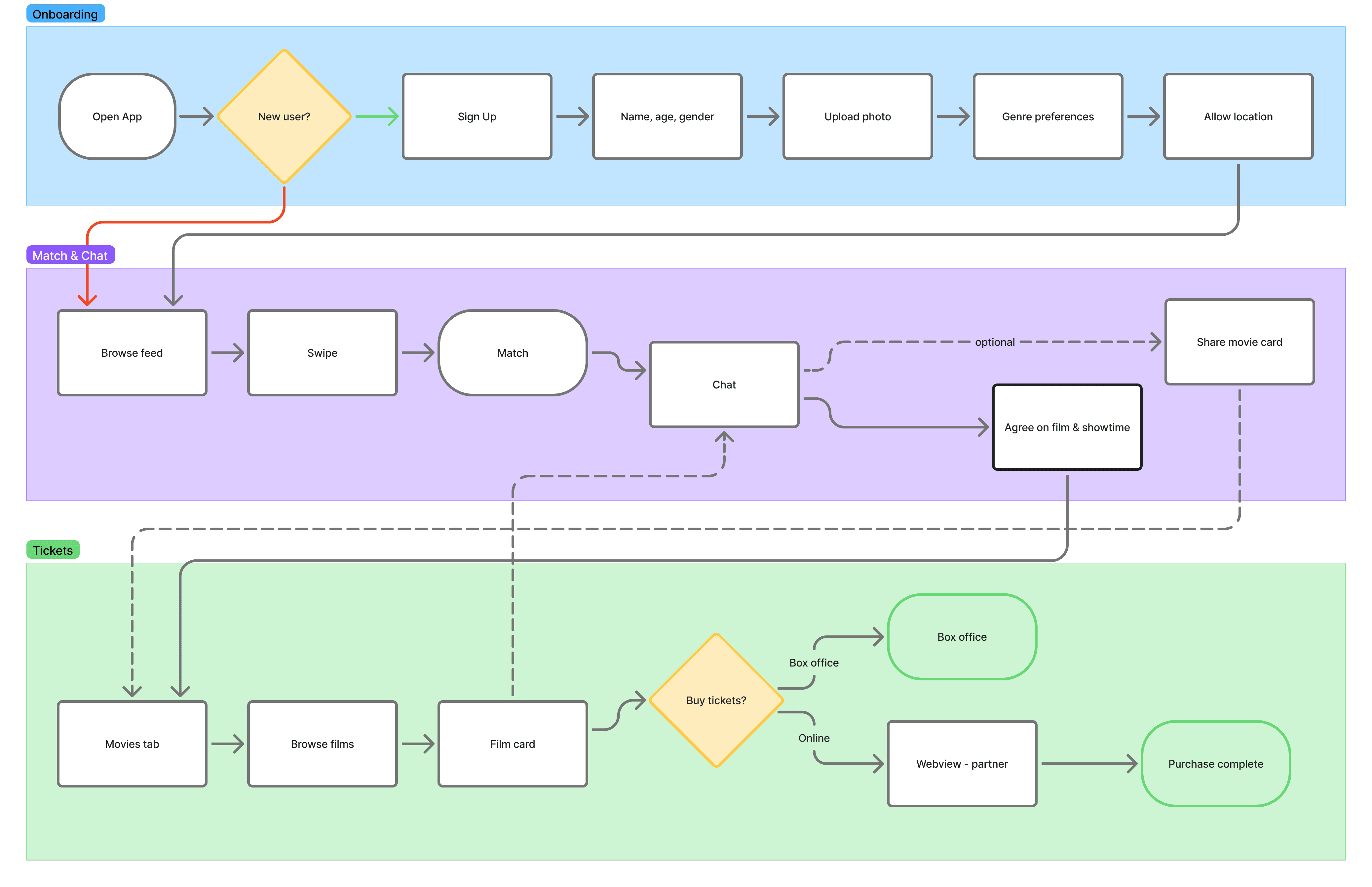
User flow
Three main scenarios end-to-end:
↓ Onboarding
↓ Match & Chat
↓ Movies & Tickets
1
Visual direction
Before opening Figma, I explored several visual directions using ChatGPT — building quick moodboards and collecting references to test different tones. I iterated through multiple concepts, discarding most of them until I landed on a dark, neon-lit cinema aesthetic.

Mood board created with ChatGPT
2
Design system
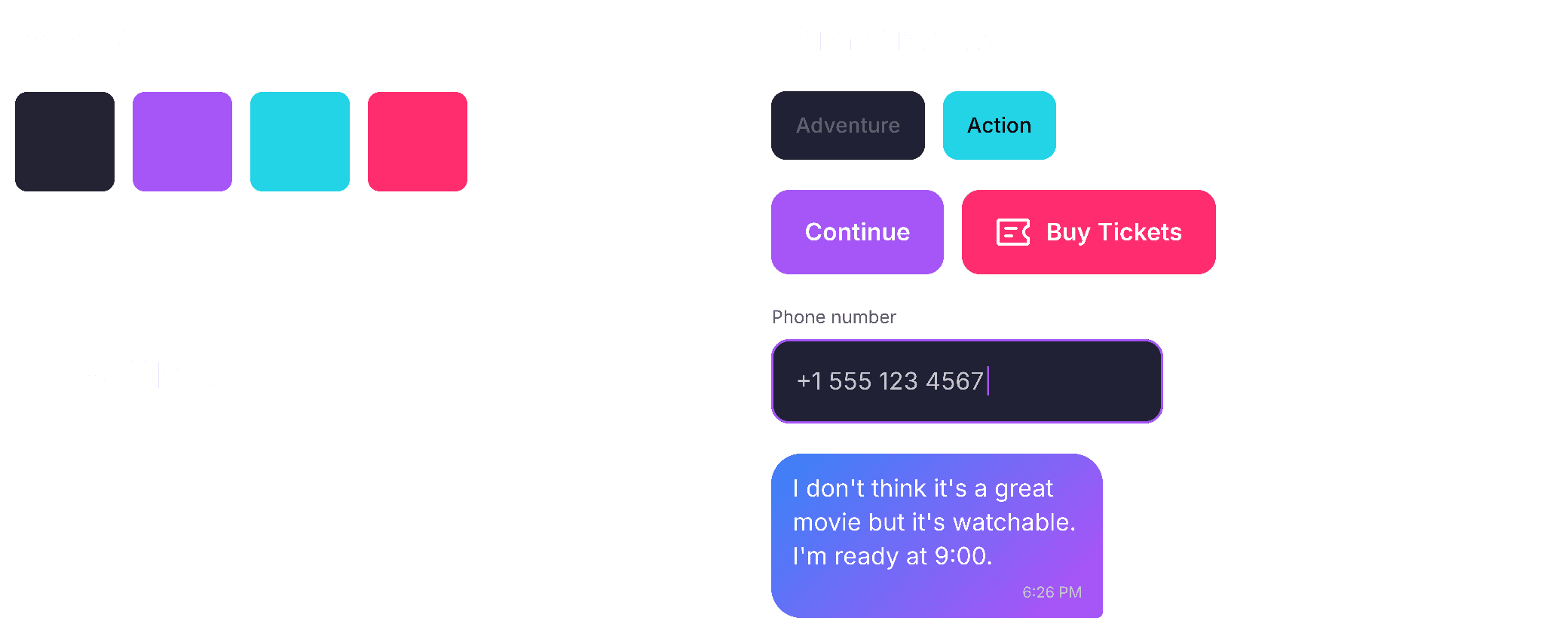
Once the visual direction was defined, I translated the moodboards into a structured design system. Using Claude Design, I generated a first system draft — including tokens, core components, and early concept screens to validate the direction at a system level.
That draft was then moved into Figma, where Claude Code, connected through the Figma MCP, helped refine and evolve it into a production-ready design system.
3
Onboarding
The goal of onboarding is deliberately narrow: capture just enough information to make matching meaningful, while keeping friction as low as possible. I focused on genre and mood preferences as the primary inputs, which later reappear as visible taste signals on every match card — reinforcing continuity between setup and discovery.


4
Feed & Match
Swiping stays familiar — like/pass gestures, no reinvention. A compatibility score based on shared genre and mood adds context without getting in the way of the flow.


5
Chat is where dates get planned
Chat is not just messaging — it’s where Watch Together lives. Showtimes are surfaced inline, turning conversation into decision-making.
Instead of going back and forth, users can pick a film in one tap and move straight to planning.
6
Movies & Tickets
The Movies section — accessible from the cinema icon in the nav bar — shows the current lineup ranked by shared compatibility, based on genre and mood overlap with your match rather than generic popularity.
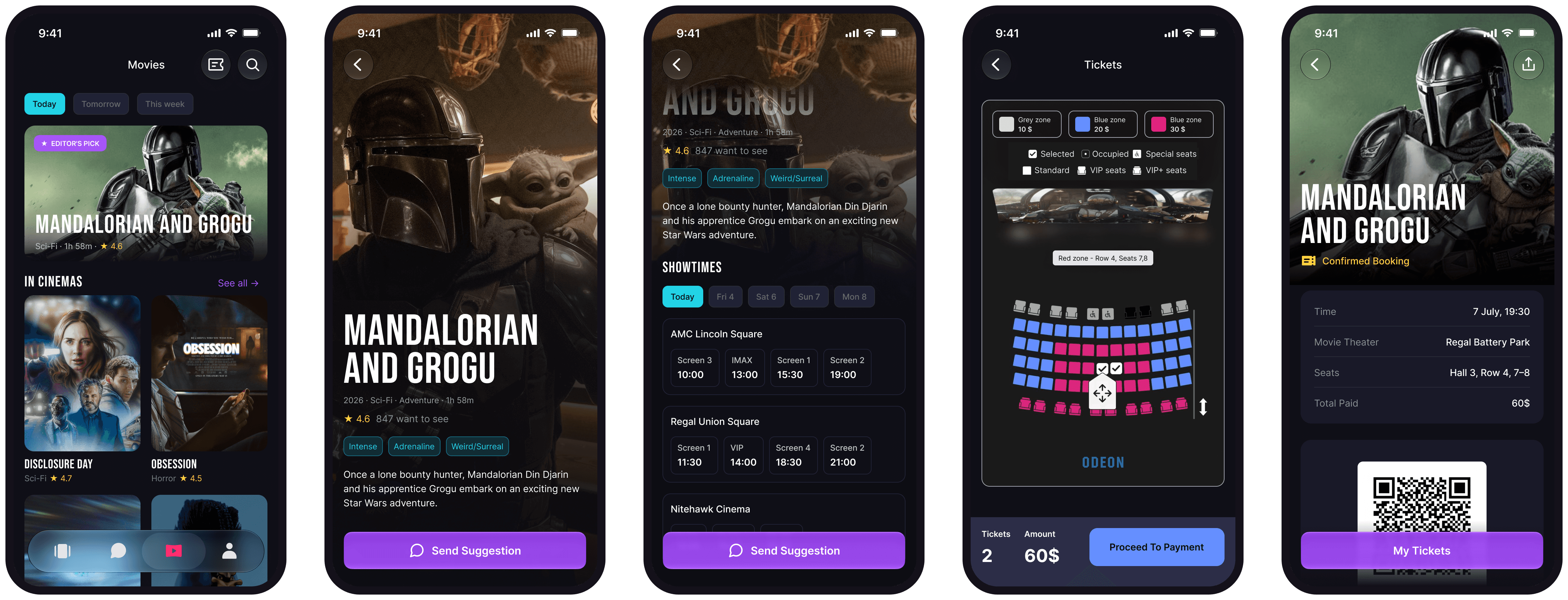

Tapping a film opens its details with synopsis and available showtimes, where you can either send it into chat as a suggestion or proceed directly to ticket purchase. Selecting a showtime starts the booking flow.
Ticketing is handled by a partner service — seat selection and payment happen externally, keeping Tonight out of transaction complexity while still bringing confirmed tickets back into the app.
Before, this would have taken a team and several weeks
This time, I moved through the entire process alone — from research and art direction to UI design and interaction. What normally spans multiple roles and handoffs became a single continuous workflow completed in days instead of months. I don’t see this as AI replacing a team, but as a shift in how far one designer can take an idea independently.
Tools used in this project
This is still a concept project. There are no real users or performance metrics, and I’m not adding any post-rationalized numbers. It’s an exploration of a new design workflow shaped by modern tools.