Virtual Gift Card
Sunlight is Russia's leading jewelry retail brand. It owns a network of more than 800 offline stores and a large online trading platform.
I was a part of big design team responsible for the end-to-end experience of their B2C application across iOS, Android and Web platforms.


Challenge
Our challenge was to design a digital gift card purchase flow from scratch. We needed to keep personalization simple — choosing a card design, adding a message, and scheduling delivery — while keeping checkout straightforward. The rest of the app is light, so we used a dark theme to clearly separate the gift card experience from the rest of the product and give it a more premium feel.
Outcome Preview
We designed and launched a polished, 7-step purchase flow based on a "One Step Per Screen" wizard pattern. By dramatically breaking down cognitive load, we successfully unlocked a highly profitable new revenue stream for the app.
To validate our design decisions and measure the business impact of this brand-new feature, we tracked key performance indicators both during the usability testing phase and following the official production launch:
74%
Funnel Conversion
Post-launch product analytics (Amplitude)
88%
Usability Success Rate
Pre-launch testing (Pathway)
4.7/5
User Satisfaction (CSAT)
In-app post-purchase survey
Initial Hypotheses & Wireframing
When we began exploring how users would interact with this new feature, two main UX hypotheses emerged. To test them objectively, I designed and prototyped two completely different design directions.
CONCEPT A
The All-in-One Page
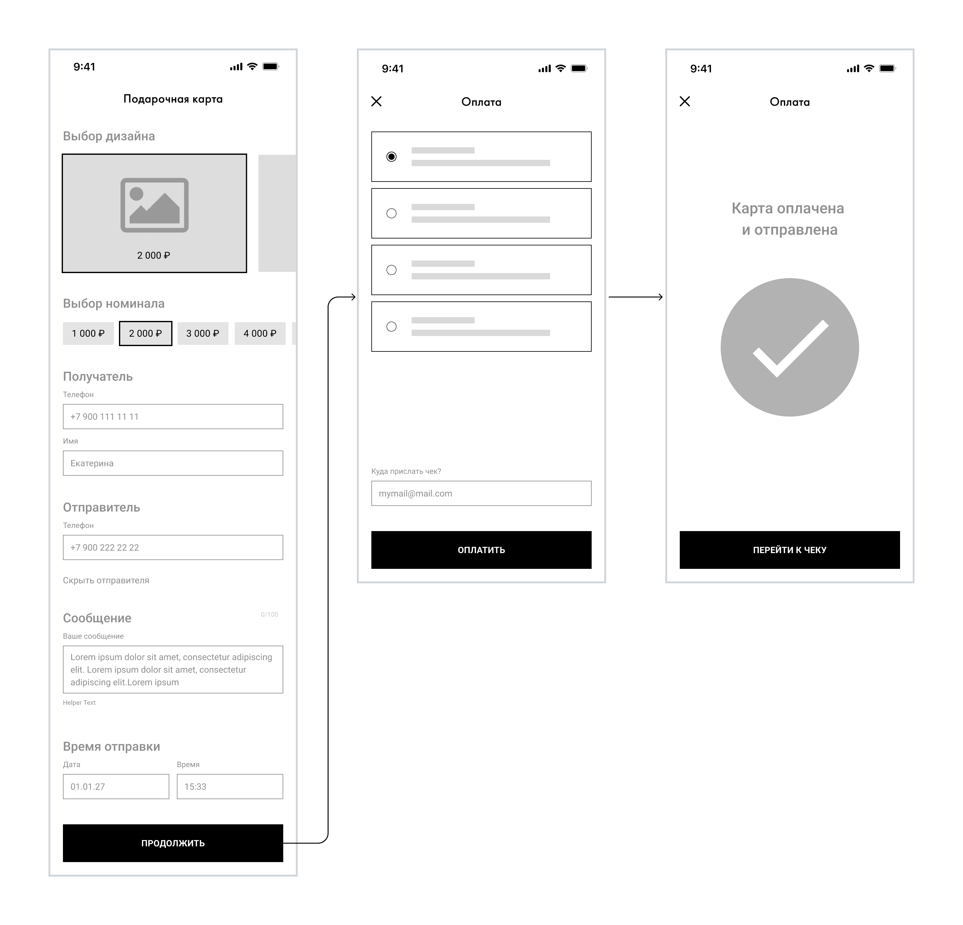
The Hypothesis: Users want fewer taps. By placing the design selection, gift amount, recipient details, etc., on a single scrollable form, we could minimize the number of taps and allow users to see the entire process at a glance.
CONCEPT B
The Step-by-Step Wizard
The Hypothesis: Users want clarity. Buying a gift is an emotional, multi-layered task. By breaking the process into isolated, single-focus screens, we could remove all visual noise and guide the user linearly.

Concept A UI
The single-screen design featured clean, collapsible cards.
The card design selector used a horizontal swipe carousel at the top, followed by input fields for the recipient's phone number and a custom message. The main challenge was visual clutter—when validation errors appeared, the screen felt overwhelming.

Concept B UI
The multi-step wizard dedicated individual screens to specific steps.
Step 1
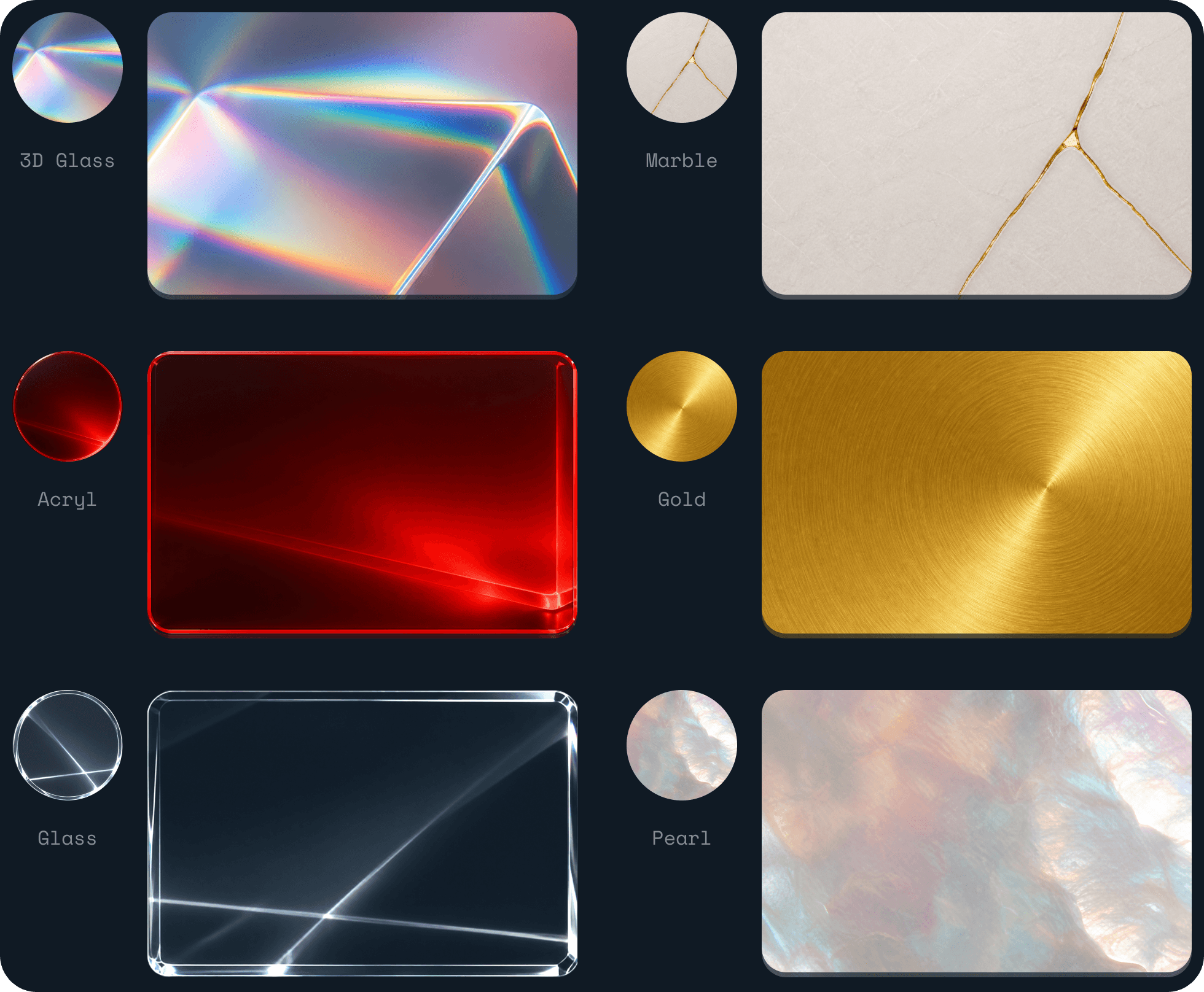
Card design selection
Users begin by choosing a visual style for the card. This sets the emotional tone and creates early engagement.
Step 2
Card Value Selection

Step 3
Recipient Information

Step 4
Message Personalization
Users can add a custom message. This step is optional, reducing unnecessary friction for quick purchases.

Step 5
Delivery Timing

Step 6
Summary & Review

Step 7
Payment & Final
Users select their preferred payment method and complete the purchase.
After successful payment a corresponding message with illustration are displayed. Then, user either closes the entire functionality or navigates to the purchases section, where the receipt will be displayed.

To choose the right direction, our UX Researcher stepped in to run a series of moderated user interviews and hands-on usability tests using interactive Figma prototypes of both concepts.
CONCEPT A
Failed to deliver
Users experienced form fatigue with a long wall of inputs. They frequently lost their place when scrolling back up to change a card design, and custom amount inputs caused cognitive friction when surrounded by other data fields.
CONCEPT B
The clear winner
Despite requiring more taps, users easily completed the process. Since each screen asked exactly one question ("Which design do you like?" → "How much are you willing to sacrifice?" → "Who is this for?"), cognitive load was reduced.
The user data was undeniable. Concept B showed significantly higher task completion speed and a drastically lower error rate. The team unanimously decided to drop Concept A and push the Step-by-Step Wizard into production.
Key Takeaways
Less complexity, more screens.
Testing proved that users prefer more screens with zero cognitive load over fewer screens packed with inputs.
Collaboration with Research is the key.
Involving a UX researcher early on allowed us to kill wrong design assumptions based on objective user data.
Transitions between steps